User Interface
symplr Recruiting uses an intuitive and consistent user interface that provides easy access to key features and areas of the system.
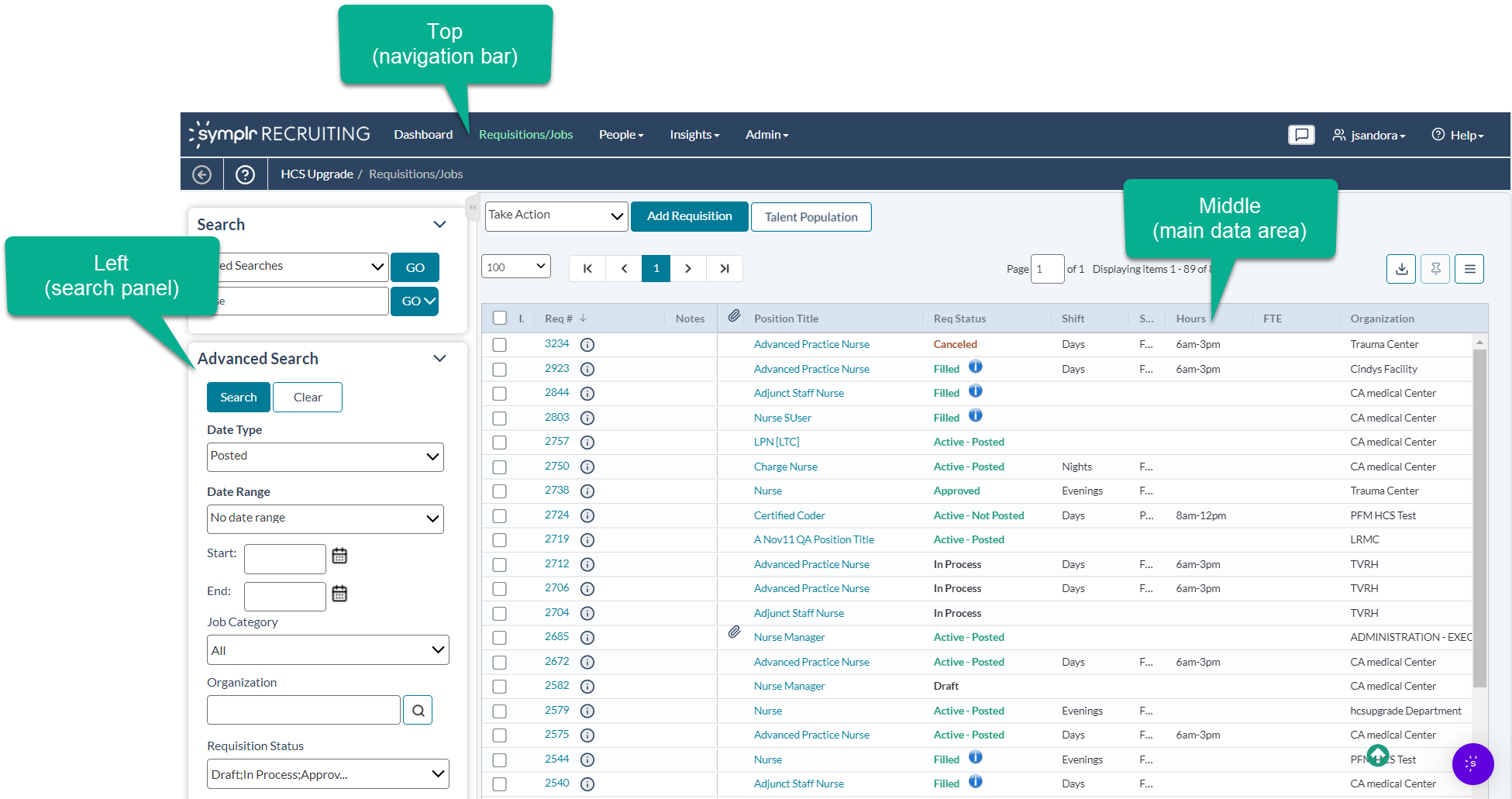
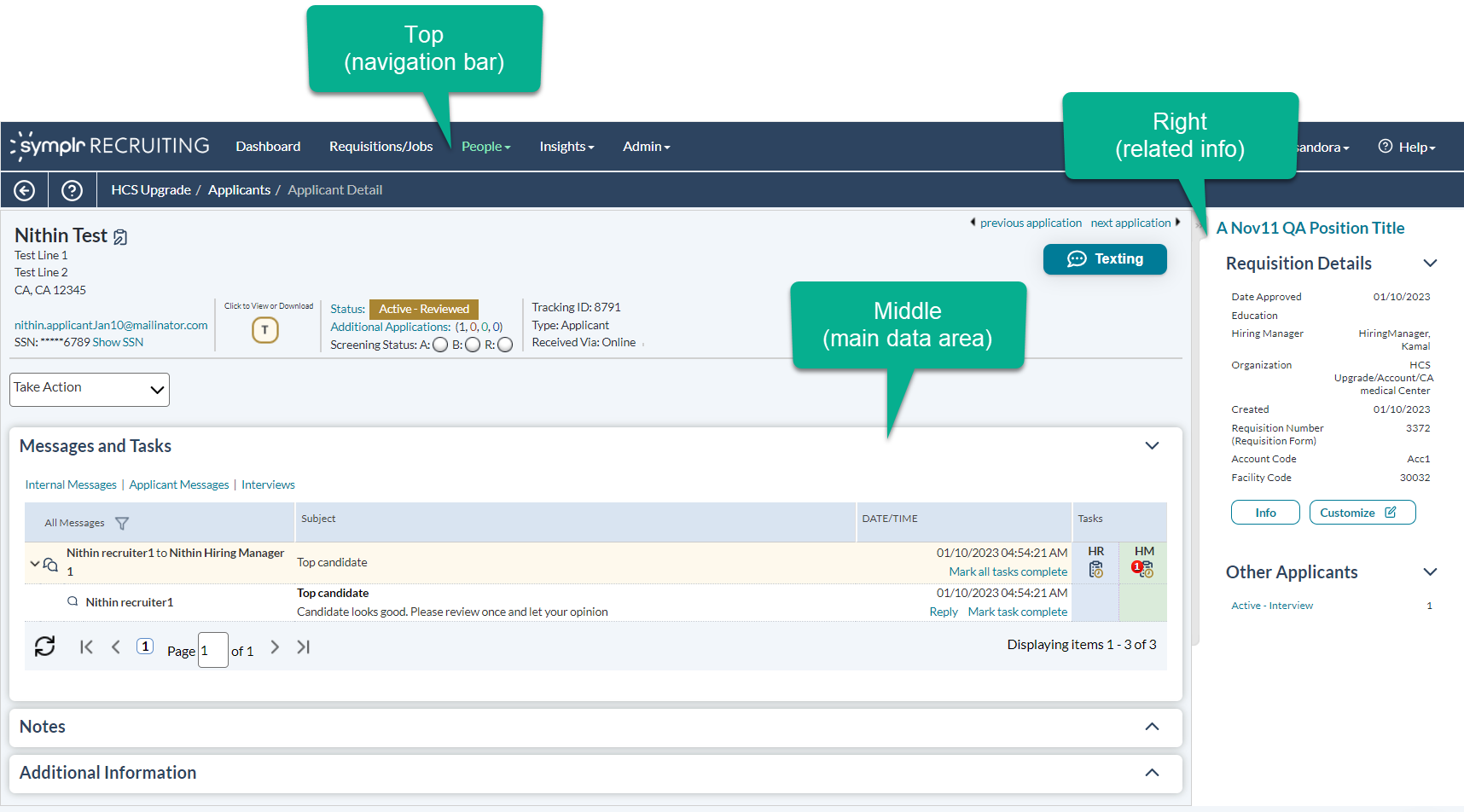
The user interface consists of the following areas:
- Top. The upper portion of the page contains the navigation bar. This is how you move from one area to another; for example, going from Requisitions to People.
- Left. On most pages in the system, the left-hand side of the page contains a Search panel to help you locate records. Once records are found and detail pages are opened, the search panel is no longer necessary, so it does not appear on those detail pages.
- Right. The column on the ride side of the page, found mainly on detail pages for specific records, is often used to display additional information related to the record being viewed.
- Middle. The large middle section of the interface is the default location for the information you're most interested in - whether it's search results or data for a specific record in the system.
The panels on the edges of the interface are used to support the work that you do in the middle. You have the flexibility to hide these panels on most pages as you like, giving you more screen real estate for the record data in the middle of the screen. In addition to the main areas, the interface also consists of menus, take action menus and links, and table toolbars.

