Applicants Layout
The Applicants page received updates similar to the ones found under Requisitions in symplr Recruiting. By combining search and results pages and providing easier batch update functionality, we’ve reduced the number of clicks and keystrokes needed to find data and perform actions.
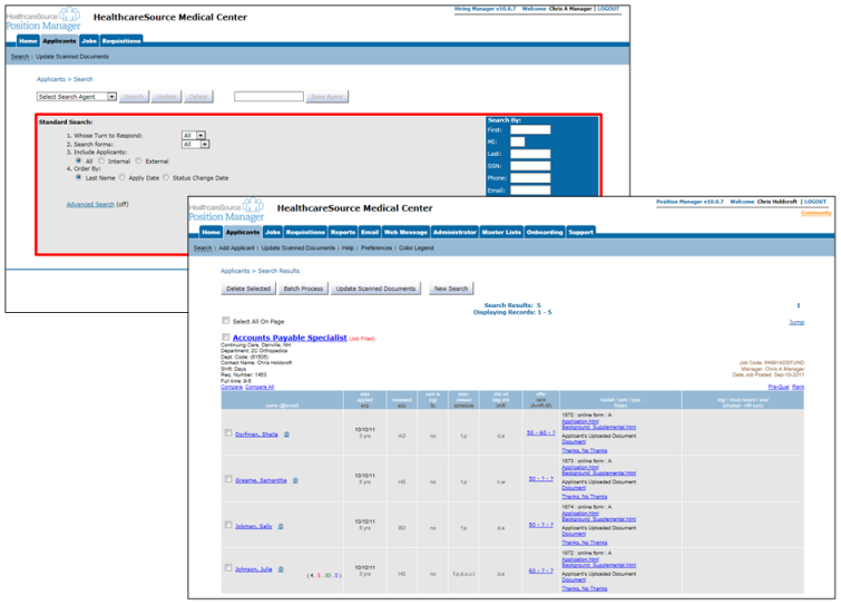
Clicking the Applicants tab in symplr Recruiting 10 loads up a search page where you can select search criteria and run a search on applicants in the system. You must first run a search before you can see any list of applicants.
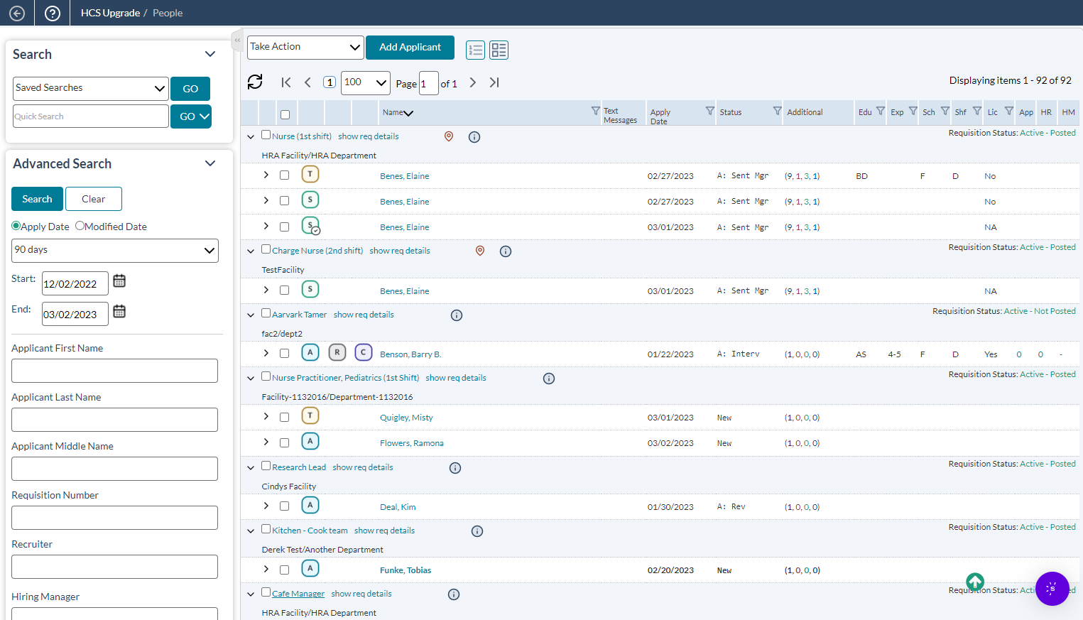
symplr Recruiting combines the Search page with the applicants list so you don’t have to click back and forth when locating applicants. A search panel sits on the left side of the screen at all times, allowing you to easily update your criteria and run another query. There’s no longer any need to click back to the previous page in order to update your search parameters.
The table also allows you to sort the results using the available column headings – a feature that is not available in symplr Recruiting 10.
The search results table for applicants may initially appear as though it doesn't offer as many details as symplr Recruiting 10 did. However, those details are still viewable in the new version.
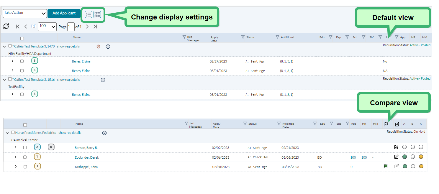
The default view for search results in symplr Recruiting provides a simple single-line view of all the applicants that match your search. We've condensed the results in order to conserve screen space, allowing you to view more listings on one screen.
An alternate view, called the Compare View, offers a different set of columns for viewing applicants. Clicking the view options above the table changes the fields that are displayed for applicants, allowing you to view the information you need right up front.
Additionally, each applicant row expands to display the detailed information available for that applicant.


