Navigation
Traditionally, symplr solutions utilize the standard “tabbed” design interface method for organizing functionality and workflows. Different functional areas within symplr Recruiting reside on different tabs to help users locate, initiate, and complete necessary tasks.
In an effort to both update the look and feel of symplr Recruiting, as well as provide the framework for future compatibility across varying platforms, a new navigation bar has been introduced.
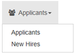
As you can see, the former tabs of the solution have been replaced with icons and links that provide an intuitive graphical representation of the functionality contained within the individual areas.
For those tabs that contain sub-pages, the new navigation bar link acts as a drop-down menu that lists all the available options under the selected area. These drop-down menus eliminate the need for landing pages for the tabs, providing immediate access to the desired pages in fewer clicks.

Along the lines of providing critical information as quickly as possible, the new navigation bar now takes up much less screen real estate than before – meaning the meat of the solution, the information you really need, has more space dedicated to its display than before. This helps immensely when dealing with smaller computer screens and mobile devices.
Old versus New
symplr Recruiting benefits from having one-to-one mapping from the tabbed approach to system navigation to the new navigation bar. This means the features, functionality, and sub-pages are in the exact same place as they were before.
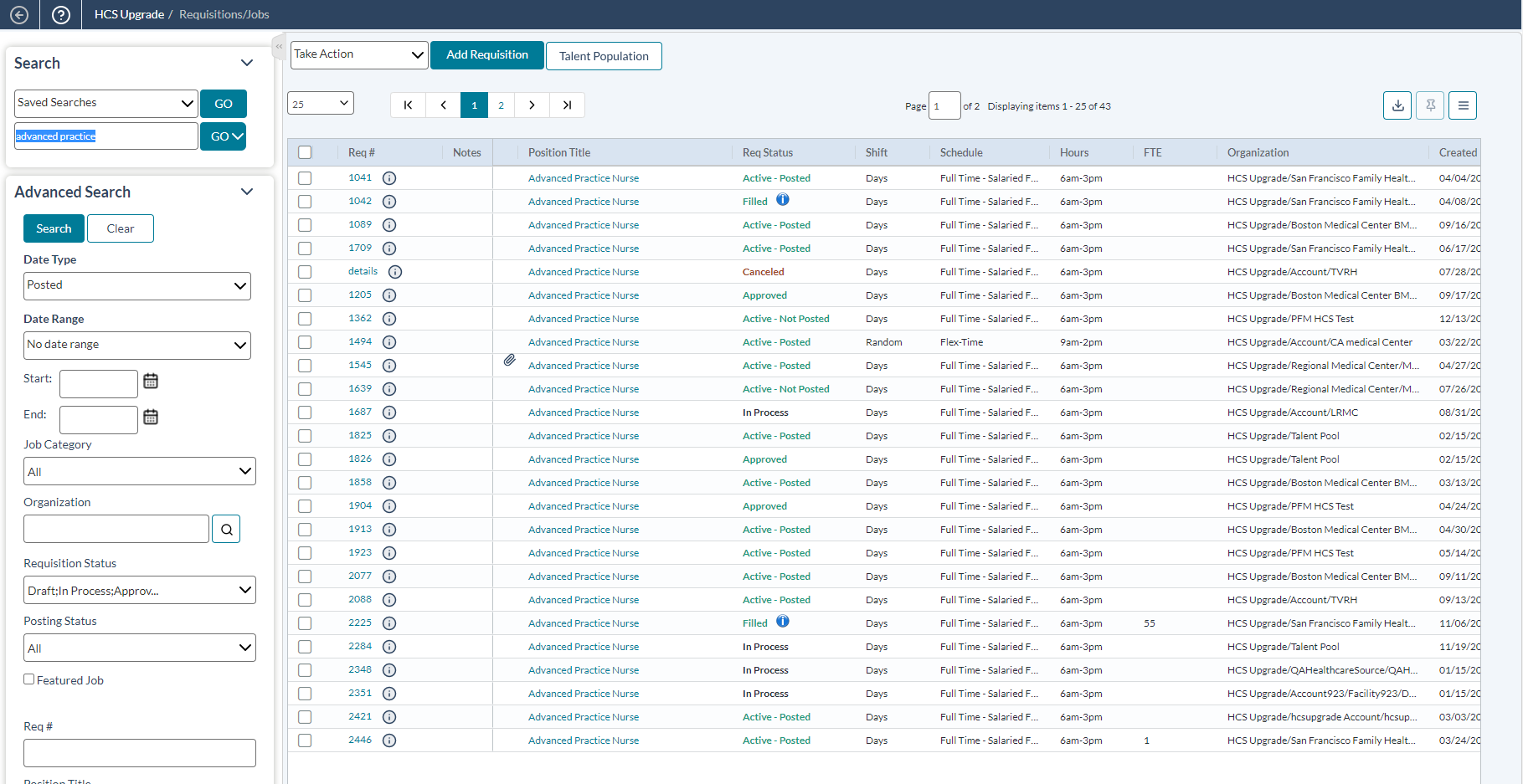
The only difference in location of items is with the online help. In the tabbed header, online help is available by clicking the ? icon next to the page name in the header bar located under the system tabs. This launched the online help system and displayed the topic related to the page currently being viewed.
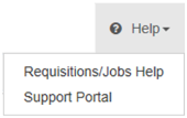
While this page-level help is still available with the new navigation bar, it is now accessed using the Help drop-down item found on the far right side of the bar. This menu contains two options:
- Page-level help. The first option in the menu is a link to the online help system for the page currently being viewed.
- Support Portal. This option opens a new browser window to the symplr support system, where users are able to enter support requests directly into the queue for client services.

With all other options residing under the same areas across both versions of symplr Recruiting, the transition from the tabbed navigation method to the new navigation bar should be a painless venture for all our users.

