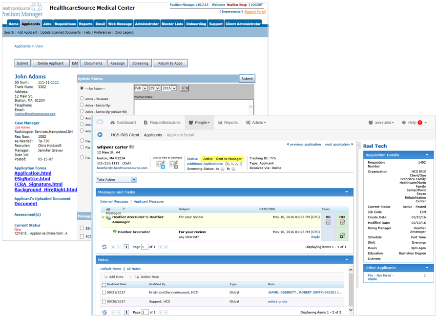
Applicant Detail Layout
The Applicant Detail page also received an overhaul, and now provides access to more information and tasks.
When viewing the Applicant Detail page in symplr Recruiting 10, you'll notice most of the pertinent applicant data is scrunched into the narrow sidebar on the left side of the page. The application itself isn't even displayed unless you click the link that opens a pop-up with application information.
Instead of showing you, well, applicant details, the majority of screen real estate is taken up by areas that provide access to features you might want to use for the applicant - such as changing status, adding notes, sending correspondence, etc.
Seems like it should be the other way around, yes? Well, now it is.
The Applicant Detail page in symplr Recruiting provides a more robust view of the selected applicant, displaying a tabbed informational view similar to that found on Requisition Detail pages. Here you can view the complete application, in contrast to the abbreviated sidebar view available in symplr Recruiting 10.
Now the details you want to see about the applicant and their application are front and center. The tabbed view helps organize everything and displays only that data you currently require.
You can still perform all the actions as before - we've just condensed them into the Take Action drop-down list at the top of the page. Using this drop-down for actions lets you see more applicant data - which is really what you need when reviewing potential candidates for your organization.
Requisition information is still on the page, too. The sidebar on the right of the Applicant Detail page in symplr Recruiting contains a brief overview of the associated requisition – including a link that will take you to the full requisition.
You can also quickly view additional applicants for the associated requisition using the available Other Applicants area in the sidebar, which is organized by applicant status.
Another way to scroll through applicants for the associated requisition is using the Previous and Next Application links at the top of the page – another new feature in symplr Recruiting that eases navigation and puts necessary information at your fingertips faster than before.
